Google’s Noto 3D emoji redesign looks like a small story until you remember how often emoji do the emotional work that words fail to do.
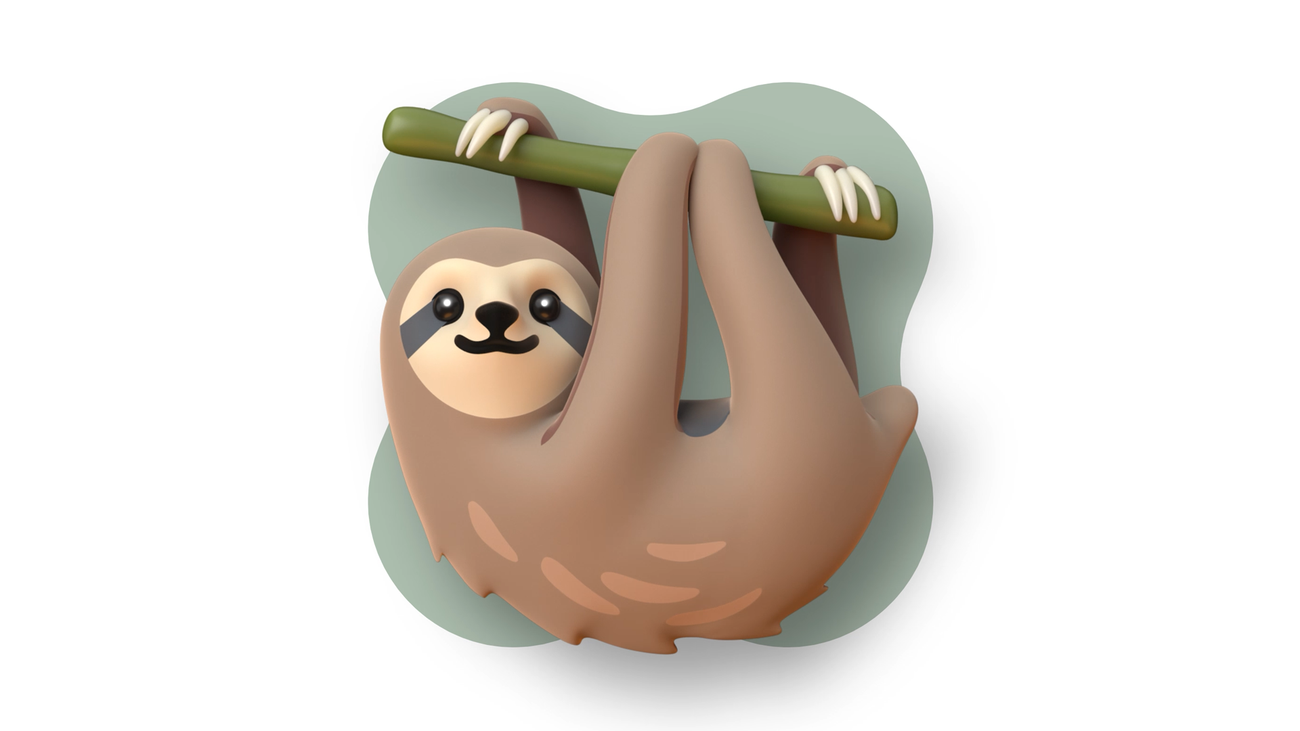
On World Emoji Day, Google published a deeper look at the design work behind Noto 3D, saying it reimagined almost 4,000 emoji with richer expressions, better accessibility and a dimensional style built for modern communication. The earlier May announcement said Noto 3D would become available across Google, starting with Pixel phones, later this year.
GearPulse’s view: this is relevant because emoji are not decoration anymore. They are part of the phone interface, the keyboard, the brand layer, the group chat, the apology, the joke, the reaction and the “I saw this but do not want to type a paragraph” button. When Google changes them, Android’s personality changes a little with it.
This is separate from our earlier Android 17 rollout article. That piece was about Google’s OS release timing. This one is about the tiny graphics that make the OS feel alive or awkward every day.
What Google changed
Google says Noto 3D updates nearly 4,000 emoji with a more dimensional look, more expressive character and accessibility considerations such as better contrast on dark backgrounds. The company also says the 3D models are open-source and available for people to remix into projects, memes or virtual worlds.
The earlier announcement set the rollout expectation: across Google, starting with Pixel phones, later in 2026. That means most Android users should still treat this as an incoming design shift, not something every phone already has today.
| Detail | Source-backed status | Why it matters |
|---|---|---|
| Scope | Almost 4,000 redesigned emoji | This is a broad visual system, not a few new icons. |
| Style | 3D, more expressive, more textured | Android messages should look less flat and generic. |
| Accessibility | Higher-contrast design work, including dark-mode considerations | Emoji have to remain readable, not just cute. |
| Rollout | Across Google, starting with Pixel phones, later this year | Availability will depend on Google’s rollout and app support. |
| Remixability | Open-source 3D models | Designers, meme makers and app builders can use the assets beyond the keyboard. |
The caveat is obvious: a redesign is not the same as a feature that changes battery life, camera quality or app speed. But visual language matters on devices people touch hundreds of times a day.
Android needed more emotional polish
Apple’s emoji have long had a strong identity. Android’s emoji history is messier, from the old blob era to flatter designs that could look clean but sometimes lacked warmth. Noto 3D is Google trying to make Android’s default emotional punctuation feel more intentional.
That sounds trivial until a message lands wrong. A face that looks playful on one platform can look sarcastic or strained on another. A gesture with poor contrast can disappear in dark mode. A food emoji can look charming or cheap. These details become part of how people read each other.
Google’s design post is unusually honest about that. It talks about emoji moving from literal symbols toward hyperbole, subtext and mood. That tracks with how people actually use them. A skull is not usually about death. A crying face can mean laughter. A sparkle can soften a sentence that would otherwise read cold.
Good emoji design is therefore not only about prettier icons. It is about reducing the number of times a tiny picture betrays the sender.
The open-source angle is the quiet power move
The most interesting part may be that Google is making the 3D models available for remixing.
That gives Noto 3D a life outside the keyboard. Developers can use the assets in interfaces. Creators can turn them into stickers, memes or small scenes. Designers can build around a familiar visual language without starting from scratch. Google gets cultural spread; users get more consistent characters across contexts.
There is a risk here too. Overdesigned emoji can become noisy. A symbol that works at large size may lose clarity at tiny keyboard scale. A 3D style can age faster than a flatter system if lighting, materials or facial expressions feel too trend-driven.
| Design tradeoff | Upside | Risk |
|---|---|---|
| More dimensional emoji | More personality and warmth | Can look busy at small sizes |
| More expressive faces | Better emotional nuance | Some expressions may read differently across cultures |
| Open 3D assets | More creative reuse | Brand consistency can fragment in the wild |
| Pixel-first rollout | Google can control the first impression | Other Android users may wait or see mixed styles |
That is why the best emoji systems feel effortless. They have character, but they do not demand attention every time you type.
What to watch on Pixel phones
The practical test will be ordinary messaging, not a press image.
Watch whether Noto 3D looks clear in Gboard suggestions, notification previews, Gmail, YouTube comments and dark-mode chats. Watch whether skin tones remain legible. Watch whether the facial expressions feel warmer or merely more cartoonish. And watch whether apps adopt the new look consistently or leave users bouncing between styles.
There is also a social test. If people start using the new emoji as reaction images, stickers and memes, Google has probably succeeded. If the designs only look good in a launch collage, they will fade into another platform-refresh footnote.
GearPulse’s read is cautiously positive. The official examples have more presence than Google’s flatter set, and the accessibility focus is welcome. The danger is that 3D emoji can slide into toy-like excess. The best outcome is not “look at this render.” It is a group chat where the little face finally reads the way the sender meant it.
Bottom line
Noto 3D will not make your phone faster, cheaper or smarter.
It may make Android feel a little more personal, and that is not nothing. Emoji sit at the soft edge of technology, where design becomes tone. Google’s redesign matters because billions of tiny emotional signals are about to get new faces.
If the rollout is clear, readable and consistent, Noto 3D could give Android something it has not always had: a default emoji style with enough character to be remembered for the right reasons.